

Introducing My Custom UI-Kit and Design System
The Vision: Consistency at Scale
As a software engineer, I frequently build personal projects, internal tools, and micro-applications. Historically, starting a new project meant writing the same boilerplate code: copy-pasting styling configurations, custom animations, custom scrollbar hacks, and basic interface elements like buttons, inputs, and cards. More importantly, maintaining a cohesive personal brand across different domains was nearly impossible without manual synchronization.
To solve this once and for all, I built and published a custom, monorepo-based design system and UI library.
- GitHub Repository: kjaniec-dev/ui-kit
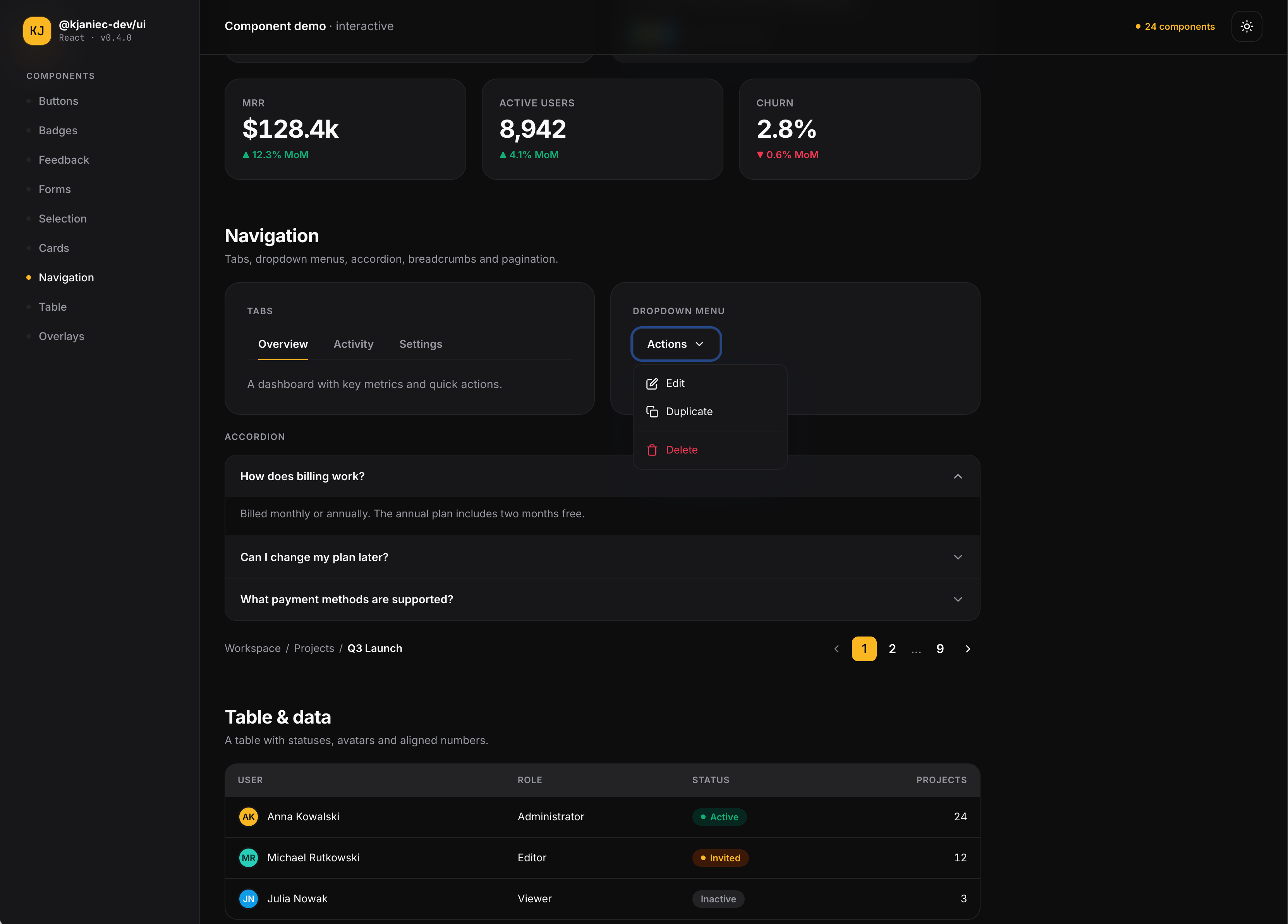
- Live Component Gallery: ui.kjaniec.dev
This design system establishes a single source of truth for my visual identity. Today, it powers all of my web applications (including this personal website!) with a premium, glassmorphic, and unified design language.
The Architecture: Under the Hood
The design system lives in a unified monorepo and is split into two distinct, highly focused packages published on npm.
ui-kit/
├── packages/
│   ├── design/  # Pure design tokens & Tailwind theme config
│   └── ui/      # React + TypeScript component library
└── apps/
    └── storybook/ # Interactive component playground & docs
1. @kjaniec-dev/design — The Foundation
The core of the design system consists of pure visual design tokens. Written using modern oklch color spaces, it defines a sleek palette including a warm amber primary tone, a vibrant teal secondary tone, custom shadows, and premium border radii.
Because it compile down to pure CSS variables and standard @theme Tailwind CSS v4 directives, it has zero runtime JavaScript dependencies. Other frameworks (or even static HTML pages) can import it without overhead:
@import "@kjaniec-dev/design/tailwind.css";
2. @kjaniec-dev/ui — The Building Blocks
Built on top of the design tokens, this is a fully typed React 19 + TypeScript component library. It exposes ready-to-use, polished primitives including:
- Actions:
Button(with variants, sizes, and leading/trailing icon support) - Selection:
Checkbox,Radio,Switch,Slider,Segmented - Data & Overlays:
Table,Tabs,Accordion,Modal,Tooltip,ToastProvider - Layouts:
Card,PageHeader,Stat
Every component styles itself using the design tokens via utility classes, ensuring that light/dark mode and any token update flow through automatically. To ensure great accessibility (a11y), interactive elements leverage Radix UI primitives and custom keyboard navigation layouts.
Tooling & Developer Experience (DX)
A design system is only as good as its documentation and ease of use. I invested heavily in establishing an excellent developer experience:
- tsup & tsc: Components are bundled into both ES Modules (ESM) and CommonJS (CJS) with auto-generated declaration files (
.d.ts), providing full autocomplete support in IDEs. - Storybook: The monorepo includes a local Storybook app for development. It provides an isolated sandbox to test every component variant, auto-generates documentation from TypeScript types, and audits accessibility constraints in real-time.
- Zero-Build Gallery (
demo.html): In addition to Storybook, the library ships a lightweight, standalone HTML gallery. It renders and demonstrates every component in real-time by loading Babel in the browser. You can open it locally without building the project.
Real-World Rollout: Ecosystem Adoption
The ultimate test for any design system is integrating it into production codebases. I recently undertook the task of rolling out this new system across my active web applications, and the results have been extremely satisfying.
1. Migrating This Website
I migrated this website's legacy CSS and component layouts to the new @kjaniec-dev packages:
- Cleaning up global CSS: Over 50% of our local stylesheet was replaced by importing the design system's variables and scrollbar themes directly.
- Deleting redundant wrappers: Components like
PageHeaderthat were previously duplicated in the local source tree were completely deleted. The pages now import these headers directly from the@kjaniec-dev/uinpm package, ensuring that any future design changes propagate instantly. - Elevating UI details: Leveraging the UI-kit's variables allowed us to add gorgeous hover states (like the custom teal-glowing WebGL card in the Hero section) and robust, accessible focus rings across all links.
2. Upgrading Planning Poker
In addition to this site, I have successfully migrated my real-time collaborative agile estimation tool, Planning Poker (GitHub repository), to the new system. Swapping out ad-hoc UI structures for the @kjaniec-dev/ui package unified the room management screens and the collaborative voting boards under the exact same premium glassmorphic visual language.
Moving forward, all of my future web projects and tools will adopt the @kjaniec-dev packages from day one, guaranteeing visual cohesion by default.
Looking Forward
Building a design system is an iterative process. Moving forward, I plan to expand the library with:
- Built-in interactive animation states (like custom floating effects)
- Polymorphic link handling for seamless integration with Next.js/Vite routing
- Universal interactive badges (
Badgewith hover and link states)
Having a unified, highly polished UI-Kit makes launching new ideas incredibly fast. Instead of worrying about spacing, border-radius, or dark-mode bugs, I can jump straight into writing the core business logic.
Check out the interactive documentation at ui.kjaniec.dev or browse the source code on GitHub!